Brand identity — 2026
SkinGlora
A brand for a dermatologist-led skin clinic in Hyderabad, built to feel clinical, calm and quietly premium, without the five-star price tag.

Brand identity for SkinGlora Skin Clinic
Concept & design by Amble Artisans
- Locale
- LB Nagar, Hyderabad
- Client
- SkinGlora Skin Clinic
- Category
- Brand identity & visual system
- Year
- 2026
The clinic
SkinGlora is a dermatologist-led skin and aesthetic clinic in LB Nagar, Hyderabad, focused on result-driven, clinic-grade treatments that still feel approachable and human.
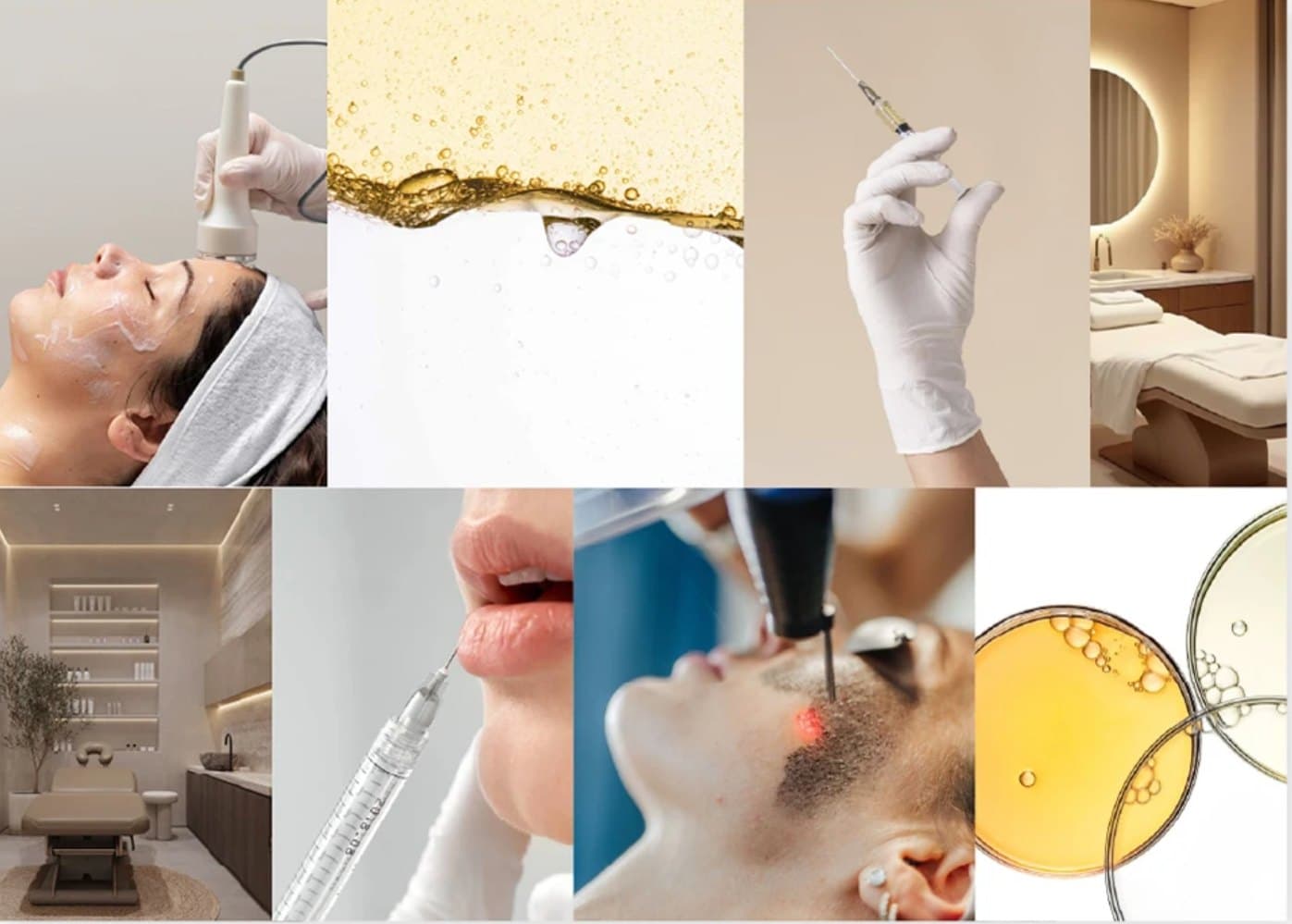
Core services
Hydrafacial · Pigmentation correction · Acne management & scars
Pricing
₹999 to ₹1,00,000, for a value-conscious but quality-seeking audience
The audience
Working professionals from nearby offices and households, mostly 22 to 35, a balanced male–female mix, living or working within about 10 km of LB Nagar.
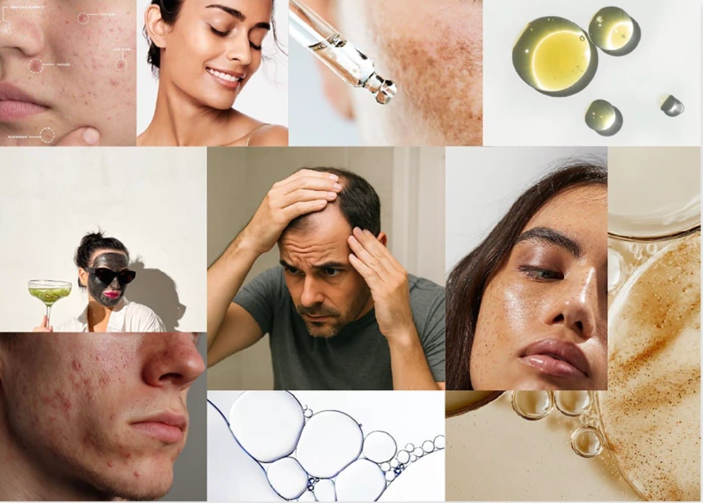
The insight
“Clinic-level solutions for everyday working professionals who want serious skin results without a five-star-hotel price tag.”
Brand feel
Premium and minimal: clean, uncluttered and modern. Rooted in human psychology, so it builds trust and feels calm, never intimidating. A balance of clinical expertise and warm behaviour.
Long-term vision
Build a strong, scalable chain of skin clinics, with SkinGlora as the flagship brand that can expand across Hyderabad and beyond.
Name & mark
The logo is built from three ideas: Skin, Glo and Ra. Together they express the promise: healthy skin, a real glow and natural radiance, backed by clinical care.
SkinGloRa
- Skin
- Dermatologist-led care
- Glo
- Glowing, even, calm skin
- Ra
- Radiance that feels confident and natural
Clean, modern sans-serif letterforms
Reflect clinical clarity and a no-nonsense approach to skin health.
Rounded curves, consistent stroke weight
A subtle nod to smooth, even skin texture.
The Glow Orb
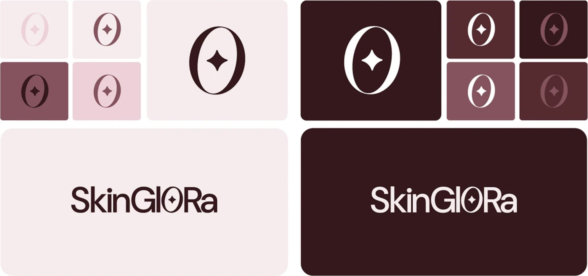
The customised “O” with a central star forms the Glow Orb: a simple, ownable symbol of even, luminous skin, and the inner glow confident patients feel.
- Works as a standalone icon for app, favicon and profile picture.
- Represents a treatment focus point: precise, dermatologist-guided care.
- Can be animated as a soft pulsing glow for reels and website transitions.
- Psychology-led communication: one calm, reassuring focal point.

Colour & type
A deep maroon ground with blush and petal tints keeps the clinic premium and warm. Typography pairs an editorial serif with a clean sans for a refined, legible voice.
Miller
Titles and key headlines — refined, premium, tied to the SkinGlora voice.
DM Sans
Body copy — clean, modern, excellent legibility in print and digital.
Miller Italic
Highlights, quotes and soft emphasis — a little human warmth.
Applications
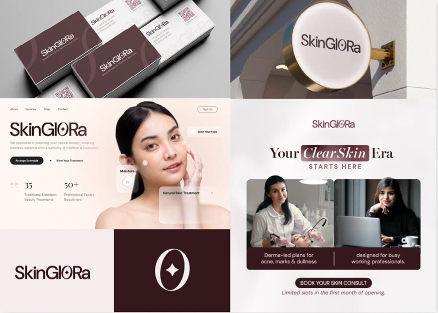
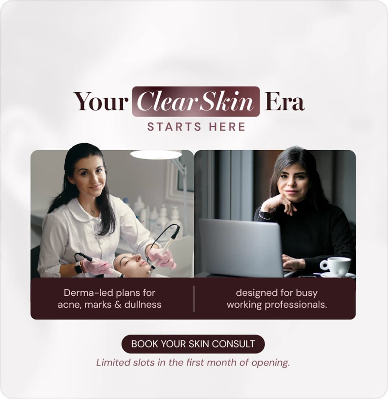
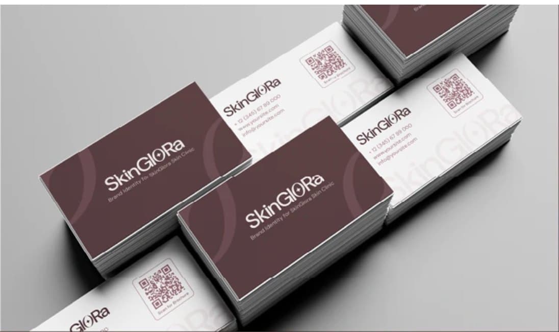
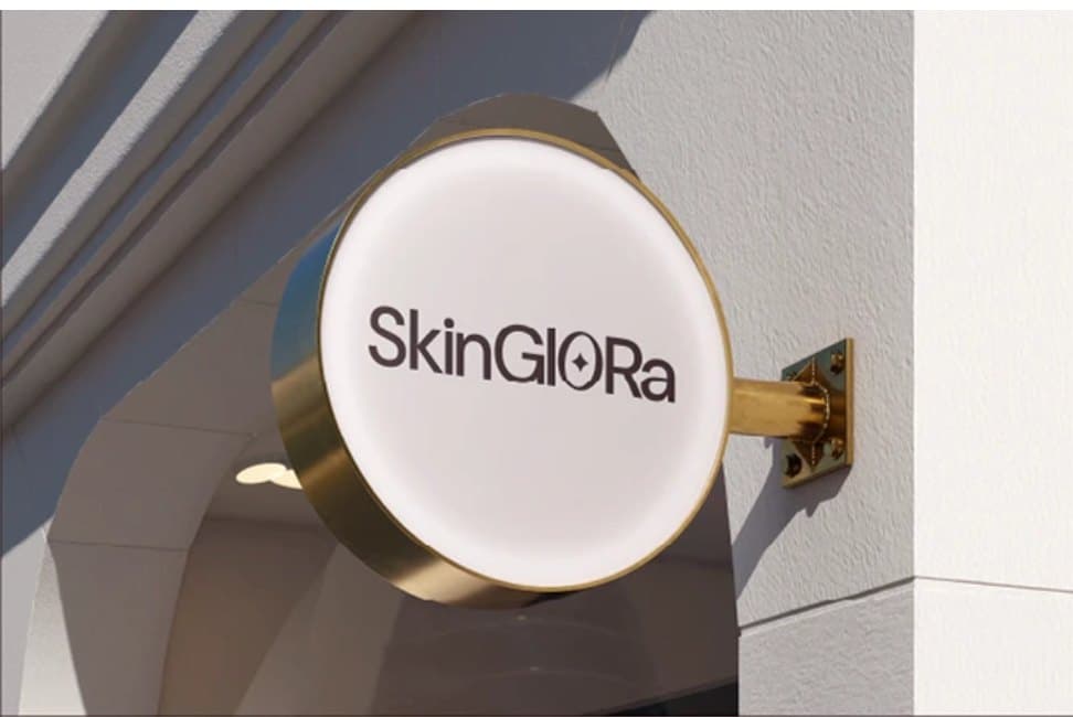
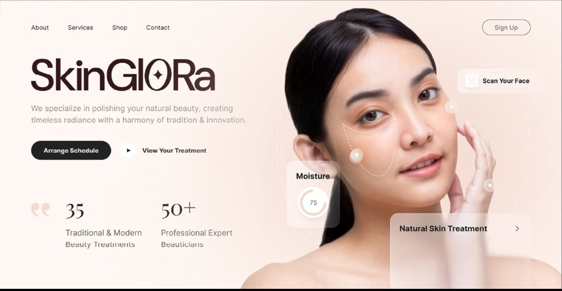
From the business card to the shop sign to the first launch ad, the system holds together at every size, ready for the clinic's opening month.
Our role
- 01Brand strategy & positioning
- 02Naming rationale & wordmark
- 03Glow Orb symbol system
- 04Colour & typography
- 05Collateral, signage & social launch creative
- 06Website direction
Up next
The Cap Vault
Brand Strategy & Brand Identity & Visual System