UI/UX concept — 2023
Rehab
A concept app that turns the hardest step of recovery, finding the right help, into a few private, guided taps.
- Where
- India
- Domain
- Health & recovery
- Type
- Self-initiated concept app
- Year
- 2023
Research & design by Charvak HerambFigma · Miro · Illustrator · Procreate
The problem
Help for addiction in India is hard to find and harder to ask for. Choosing a rehab means word of mouth, cold calls and guesswork, with stigma at every step, so many people never take the first one.
~16 crore
people in India currently use alcohol (ages 10–75)
~60 lakh
people live with an opioid use disorder
Source: AIIMS NDDTC — Magnitude of Substance Use in India, 2019
How might we
How might we make the first step toward recovery feel private, simple and safe?
Who it's for
People aged 16 and up who live with addiction, and the family and friends who often start the search for them. The launch focus is Tier 1 and Tier 2 cities.
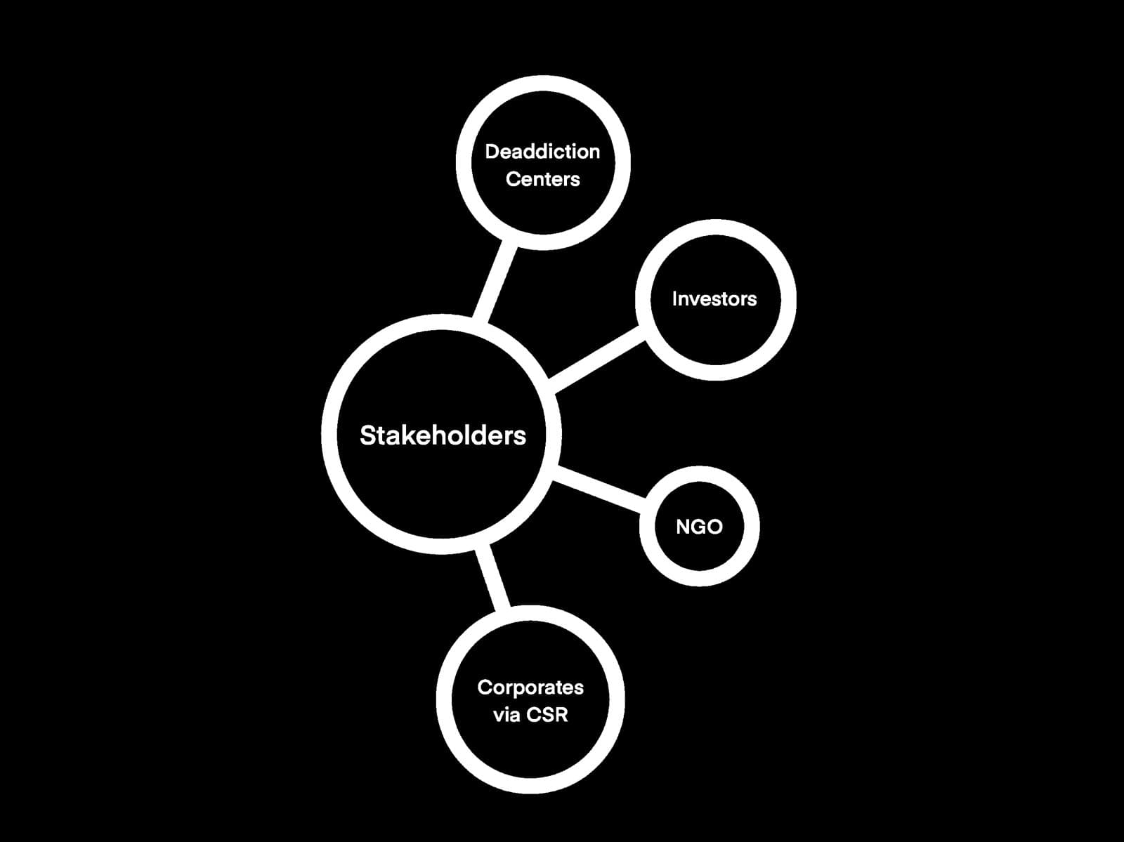
De-addiction centres
Get qualified, ready-to-book patients
NGOs
Reach people earlier, track outreach
Corporates via CSR
Fund access and awareness
Investors
Back a first-mover in the space
Research & insight
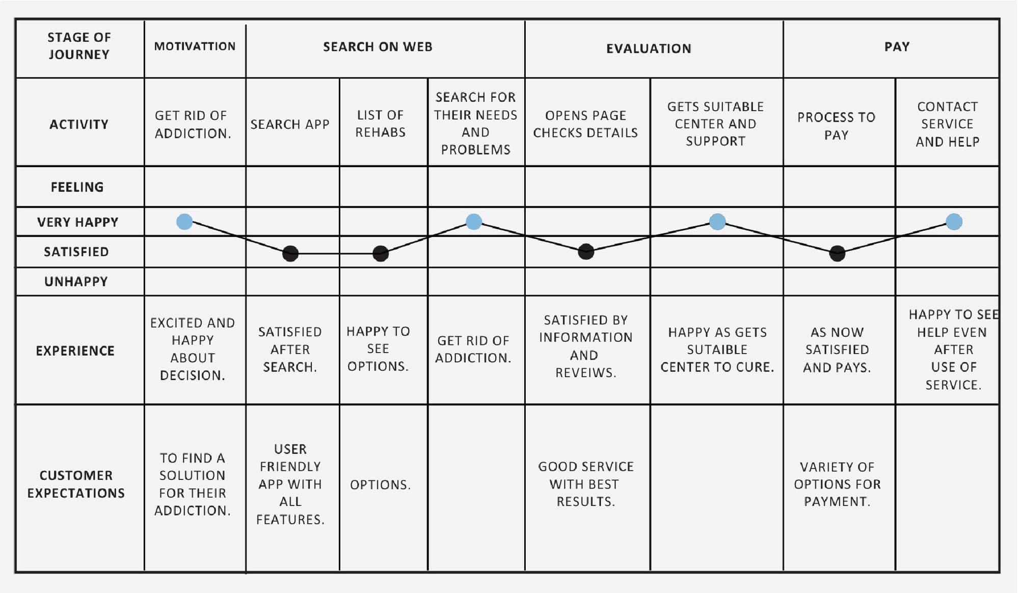
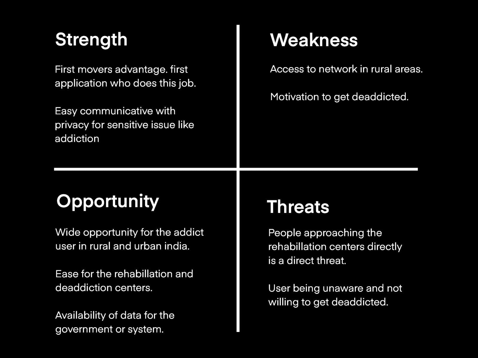
A SWOT and a customer journey map showed that the make-or-break moments come before treatment, while searching for and evaluating a centre.
Insight 01
Search and evaluation carry the weight
Most of the journey happens before treatment. People expect a user-friendly app, real options, and information and reviews they can trust before they commit.
Insight 02
Privacy is the product
The biggest strength in the SWOT: easy, discreet communication on a deeply sensitive issue.
Insight 03
Motivation is fragile
The main threats are people unaware of, or not yet willing to seek, help. The app has to meet them before they're ready.
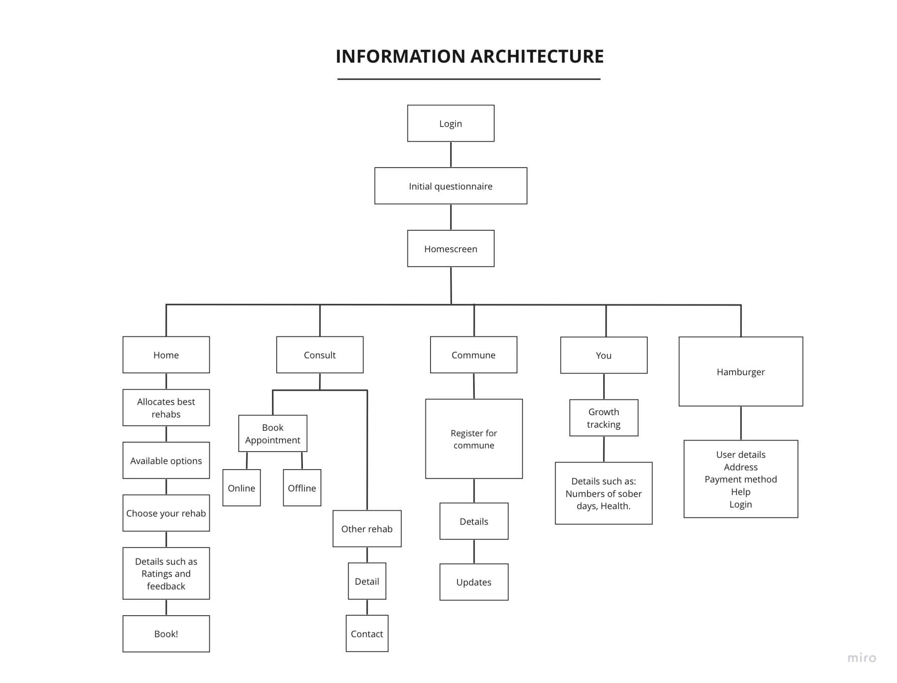
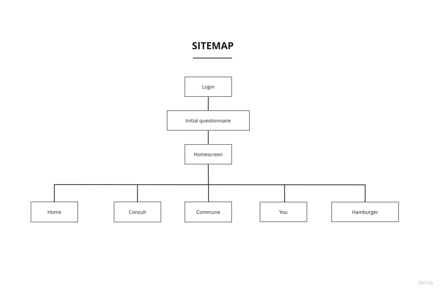
Structure
Everything hangs off five tabs: Home, Consult, Commune, You and Menu. A short intake questionnaire sits before Home, so the first screen a person sees is already personal.
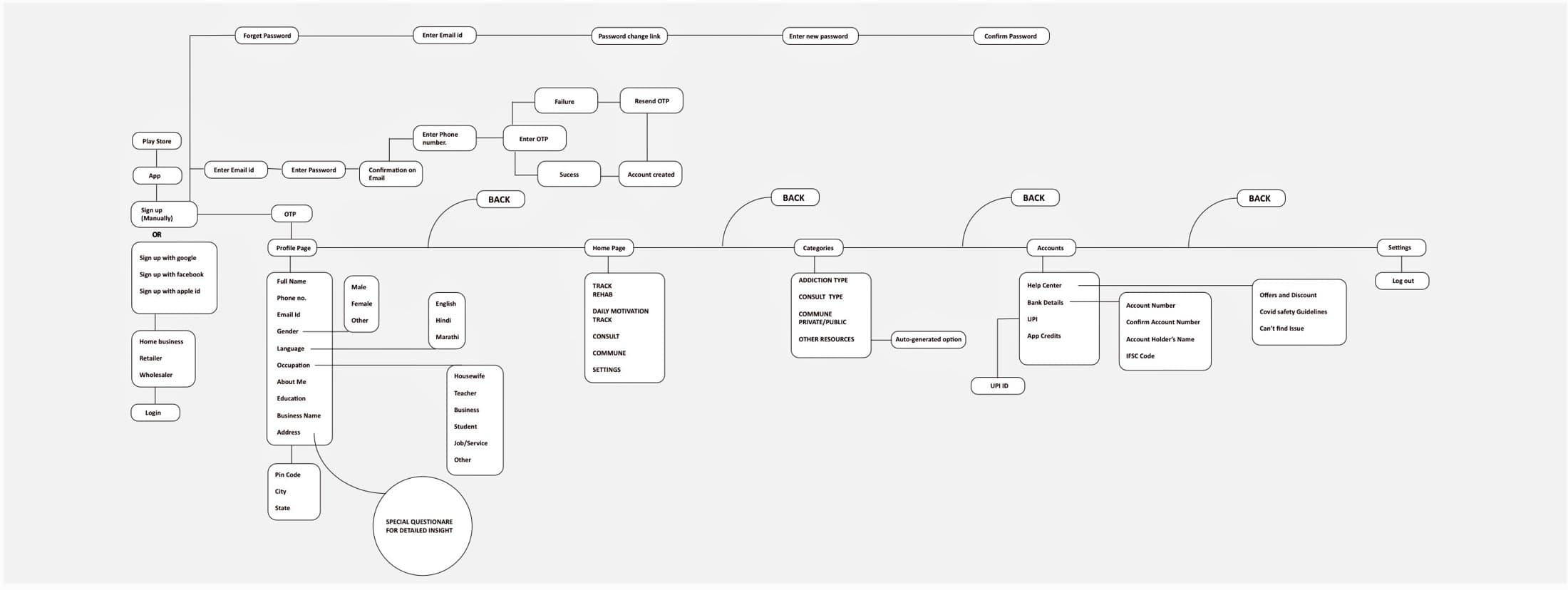
Key flows
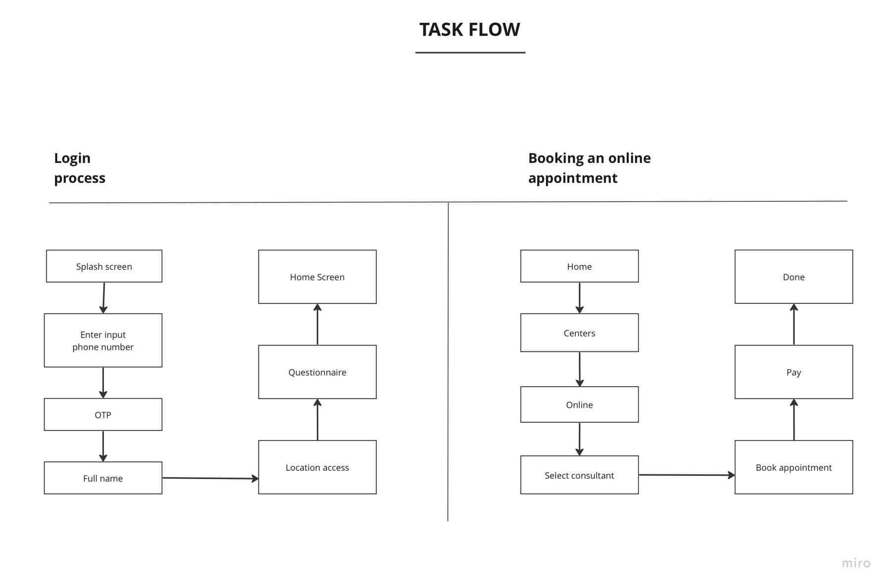
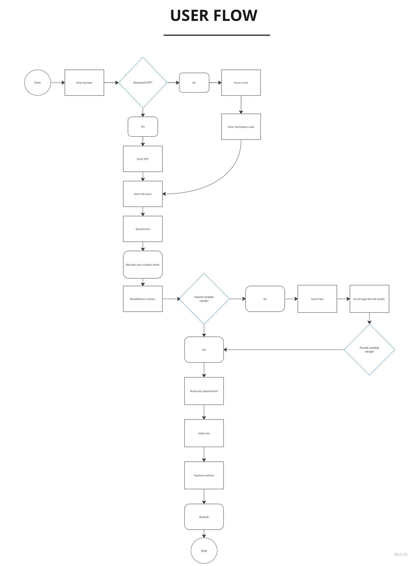
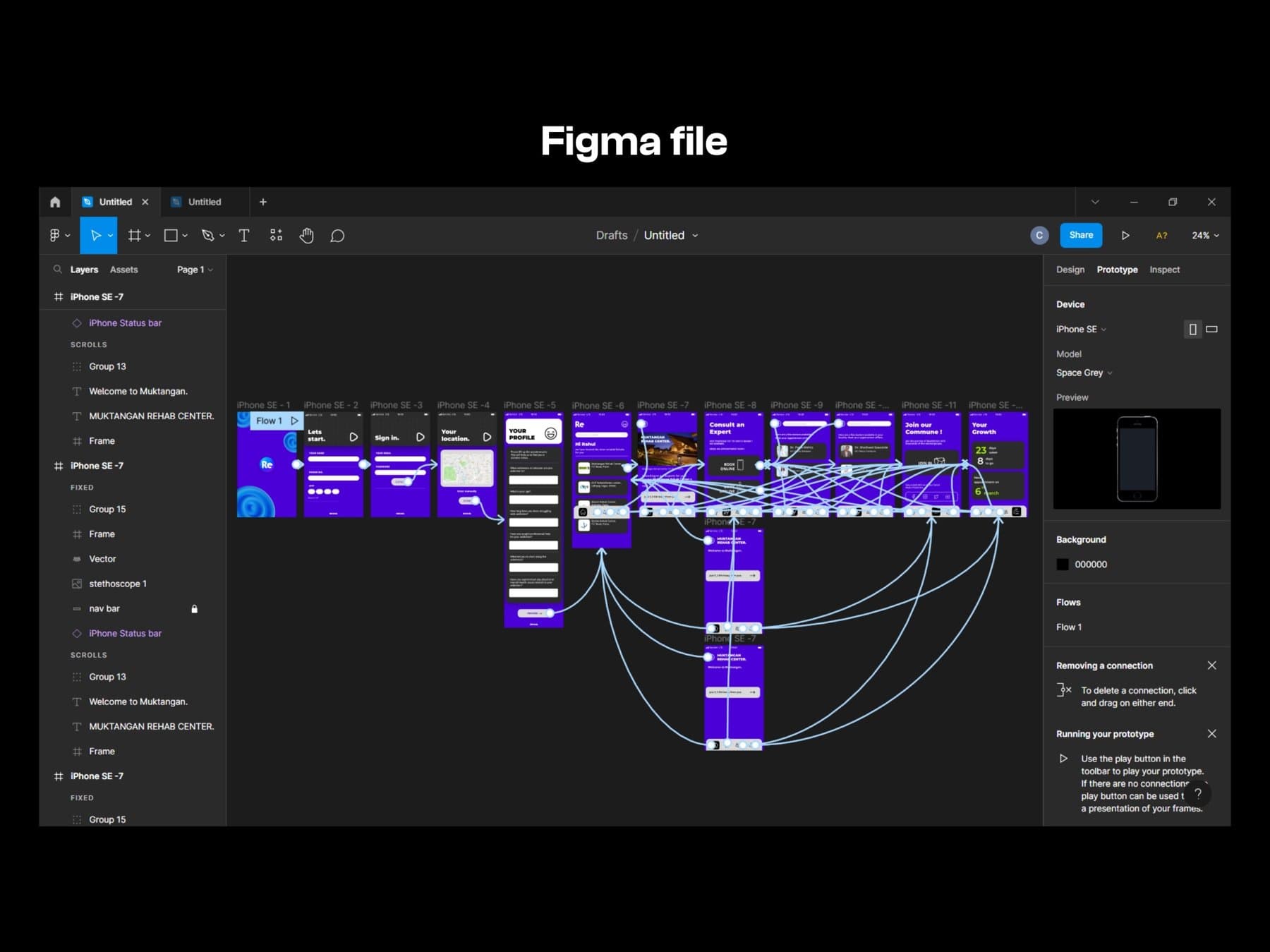
Two tasks decide whether the app works: getting set up, and booking help. Both were mapped end to end and kept to as few decisions as possible.
Get set up
- Phone & OTP→
- Name→
- 3-question intake→
- Location access→
- Matched centres
Book help
- Home→
- Centre or expert→
- Online / offline→
- Pick a slot→
- Book & pay
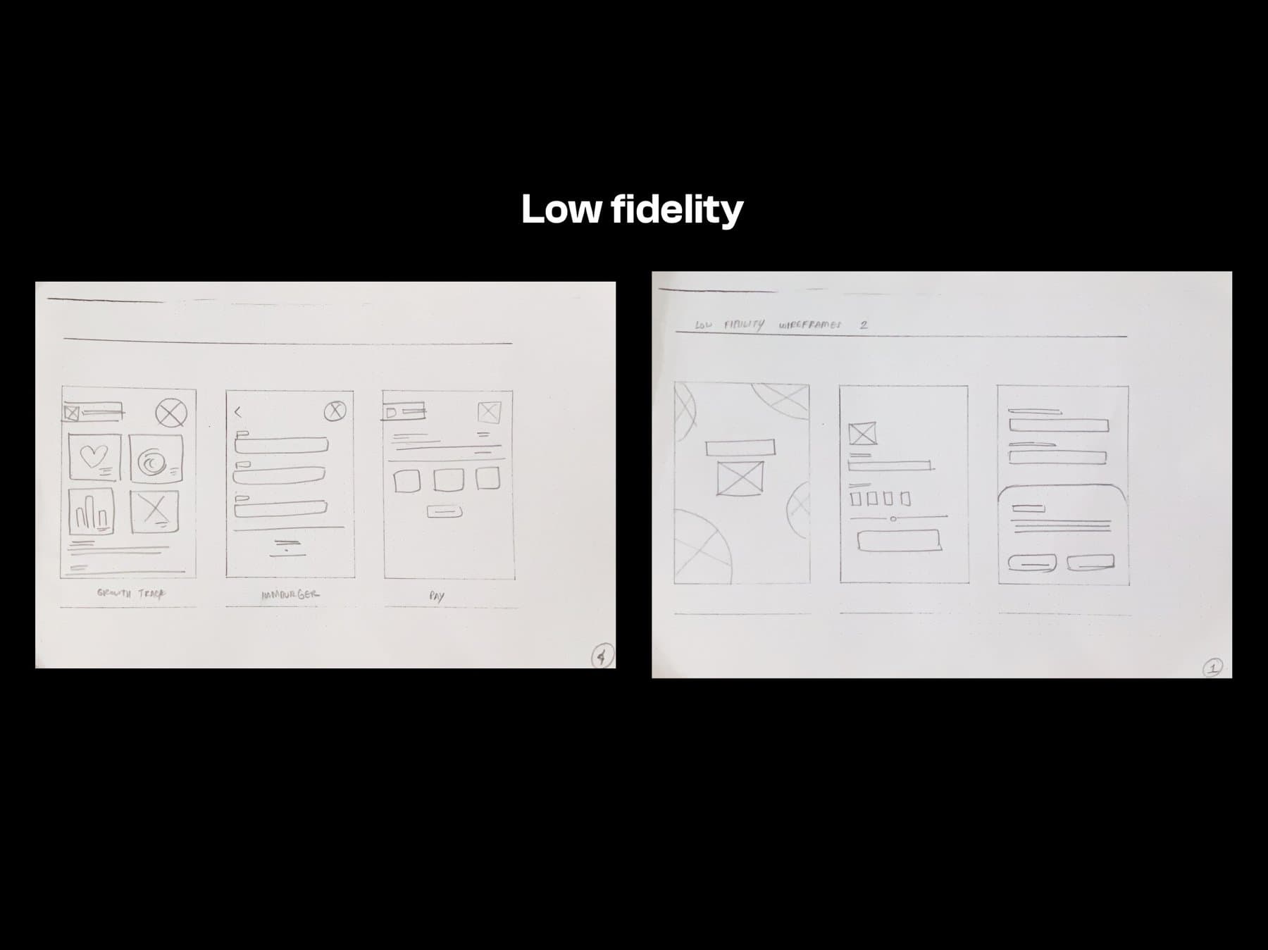
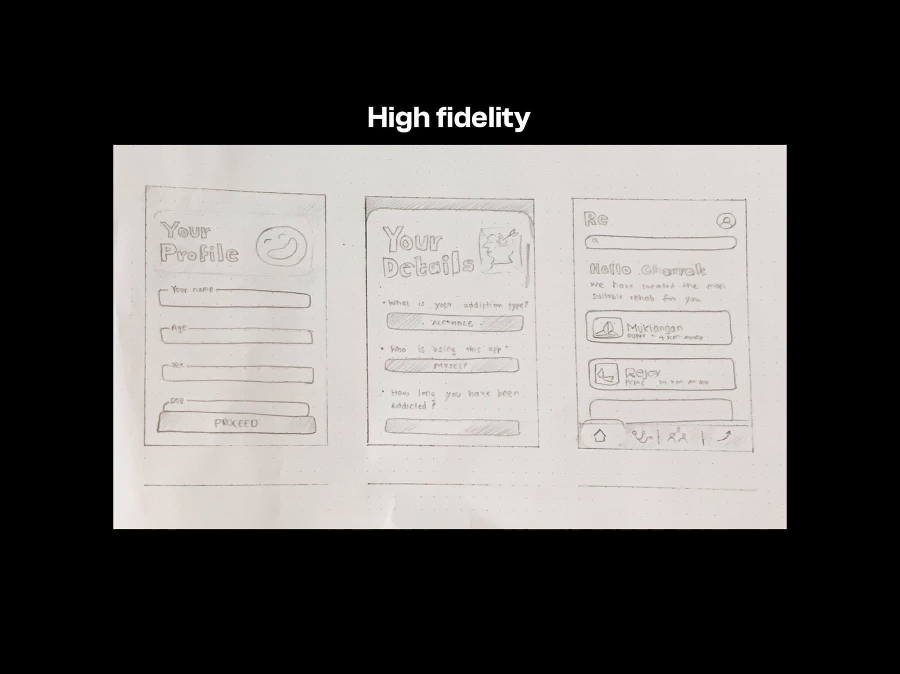
Sketch to prototype
Paper first, to move fast on layout and hierarchy, then refined sketches, then a clickable Figma prototype wiring every flow together.
Visual language
A confident violet sets a calm, trustworthy tone; dark graphite cards hold the content; lime is saved for progress, so every sober day feels like a win.

Minimal, outlined icons. The launcher icon's blue gradient signals trust with a modern, dynamic edge.
The app
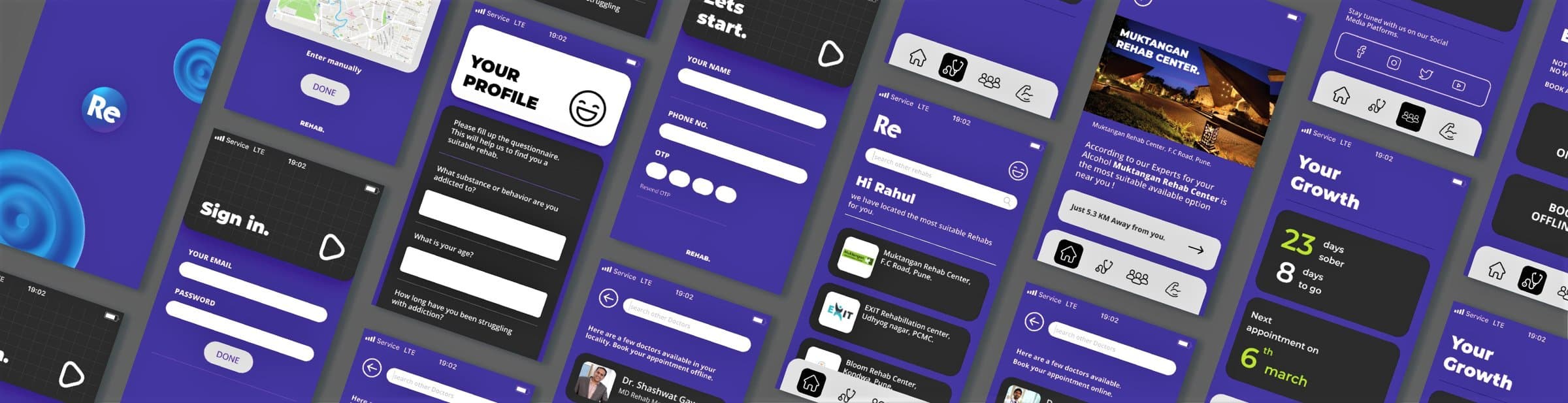
Eight screens, one job each. Every screen answers a single question for someone who may be one bad day away from giving up.

01Splash
Just the “Re” mark. Nothing on screen says addiction.
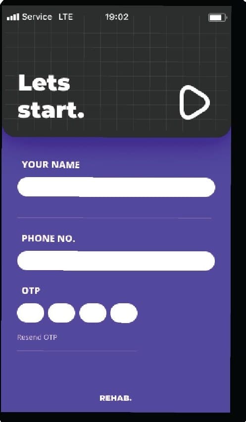
02Let's start
Name, phone and OTP. No password to forget.
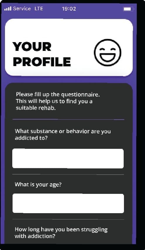
03Your profile
Three plain questions: what, how old, how long.
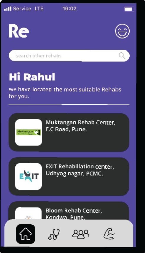
04Home
Matched centres nearby, ready the moment intake ends.
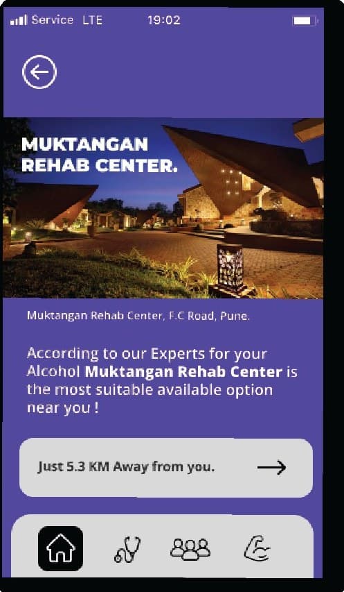
05Centre
Why it fits, how far it is, one clear next step.
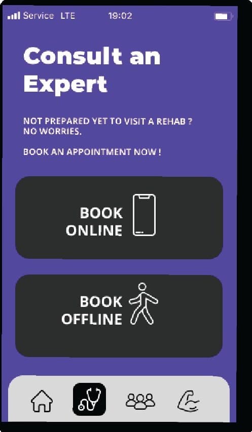
06Consult
Not ready to visit? Book an expert online or offline.
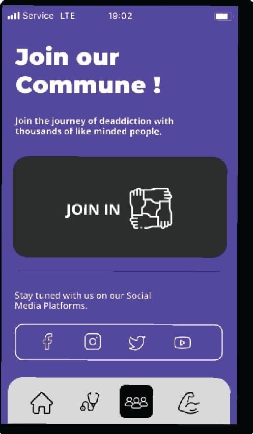
07Commune
Join people walking the same road.
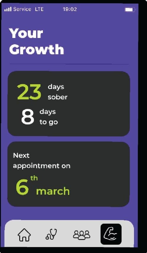
08Your growth
Sober-day streak and next appointment, in lime.
What we'd sharpen next
Looking back with fresh eyes, here's how we'd push the concept from a good idea to something a clinic could ship.
01
Person-first language
Say “someone living with addiction”, never “addict”. Warm, non-judgemental microcopy throughout.
02
Discreet by default
Neutral app name and icon option, app lock and silent notifications. The sign-up screen's “REHAB.” wordmark could out someone.
03
Clinically sound intake
Swap ad-hoc questions for validated screeners like AUDIT (alcohol) and DAST-10 (drugs), reviewed by clinicians and framed as guidance, not diagnosis.
04
Help is one tap away
Keep India's free, 24×7 national de-addiction helpline, 14446, visible on every screen, and surface it straight away on high-risk answers.
05
Trust signals for centres
Verified licences, cost ranges, treatment approach and moderated reviews, so comparing rehabs stops being guesswork.
06
Family mode & access
Let a well-wisher search and book on someone's behalf. Add Hindi and regional languages, larger text and AA contrast checks.
Measure
Time to first booking
How fast intake turns into a real appointment
Measure
Intake completion
Share of people who finish the three questions
Measure
30 / 90-day check-ins
Whether the growth tracker keeps people coming back
Process
Research & design by Charvak Heramb.
- 01Problem framing
- 02Stakeholder map
- 03SWOT
- 04Customer journey map
- 05Information architecture
- 06Task & user flows
- 07Wireframes
- 08Visual design
- 09Figma prototype
Up next
SkinGlora
Brand Identity & Logo Design & Visual System